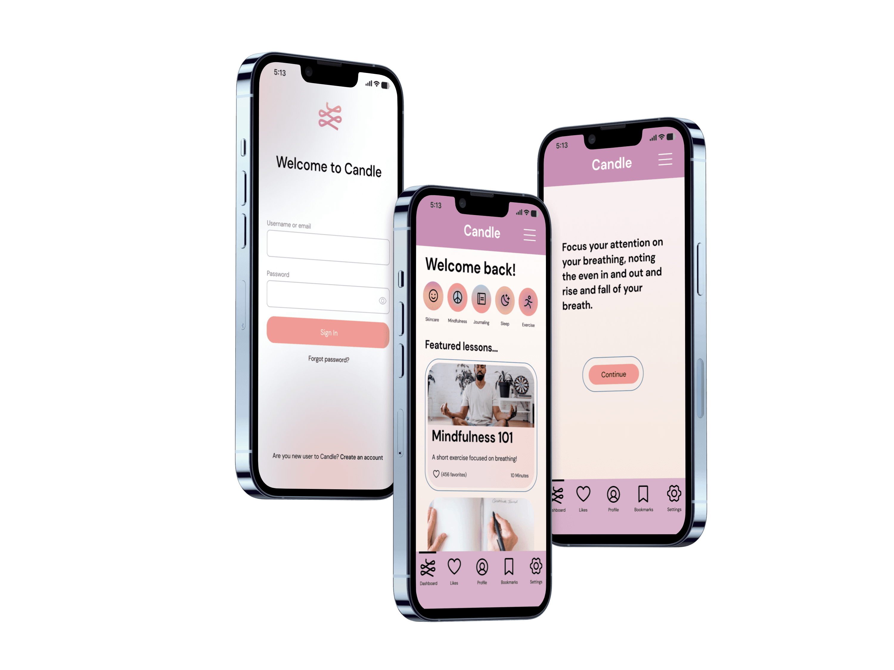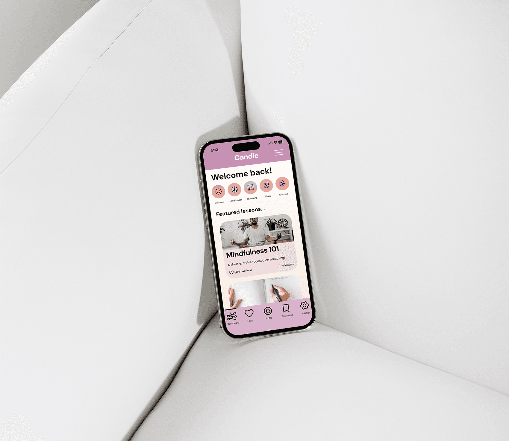
Whether you want to learn new self-care techniques
or hold yourself accountable to new ones, it can be hard to
stay current with treating yourself right due to the fast paced
nature of today's world. Candle is a go-to resource for
self-care resources such as Mindfulness, Exercise,
Journaling, and Relaxation.
Challenge
it can be hard to stay current with treating yourself right due to the fast paced nature of today's world.
Solution
Candle offers personalized self-care journeys initiated with a simple onboarding process utilizing guided surveys.
Role
User research, UX and UI design, Wireframing, Prototyping
OBSERVING AND ITERATING
Research
01 /
Competitive Analysis
In addition to interviewing users, I did competitive analysis via the SWOT method to break down what made some similar apps available, and what we could do differently.
Meditations
Sleep stories
In house library of media
Subscriptions offered
Gamified
Personal experience
Utilizing cute avatars
Limited free access
Could offer more range of premium subscription
Lacking free resources
Calm
Finch
02 /
User Interviews
I conducted in person and virtual interviews via Discord calls with interviewees who all had varying levels of existing self-care practices.
Summarized Findings
5/6 of participants explained they had a hard time finding time to actualize their self care.
Popular categories of self-care included skin care, self-reflection, yoga, and mindfulness.
Interviewees were interested in how to build better discipline and space for their self care.
The desire to track/log self-care in order to structure and hold oneself accountable was expressed by several.
INITIAL IDEATION
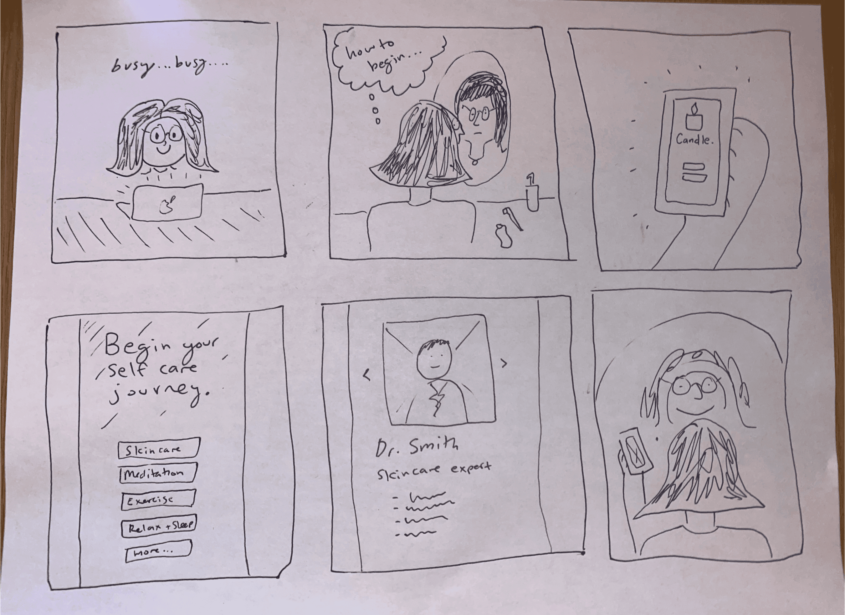
I approached brainstorming from two perspectives- gathering inspiration to formulate an aesthetic for the look and feel and sketching/ storyboarding various journeys that users could take utilizing the app.
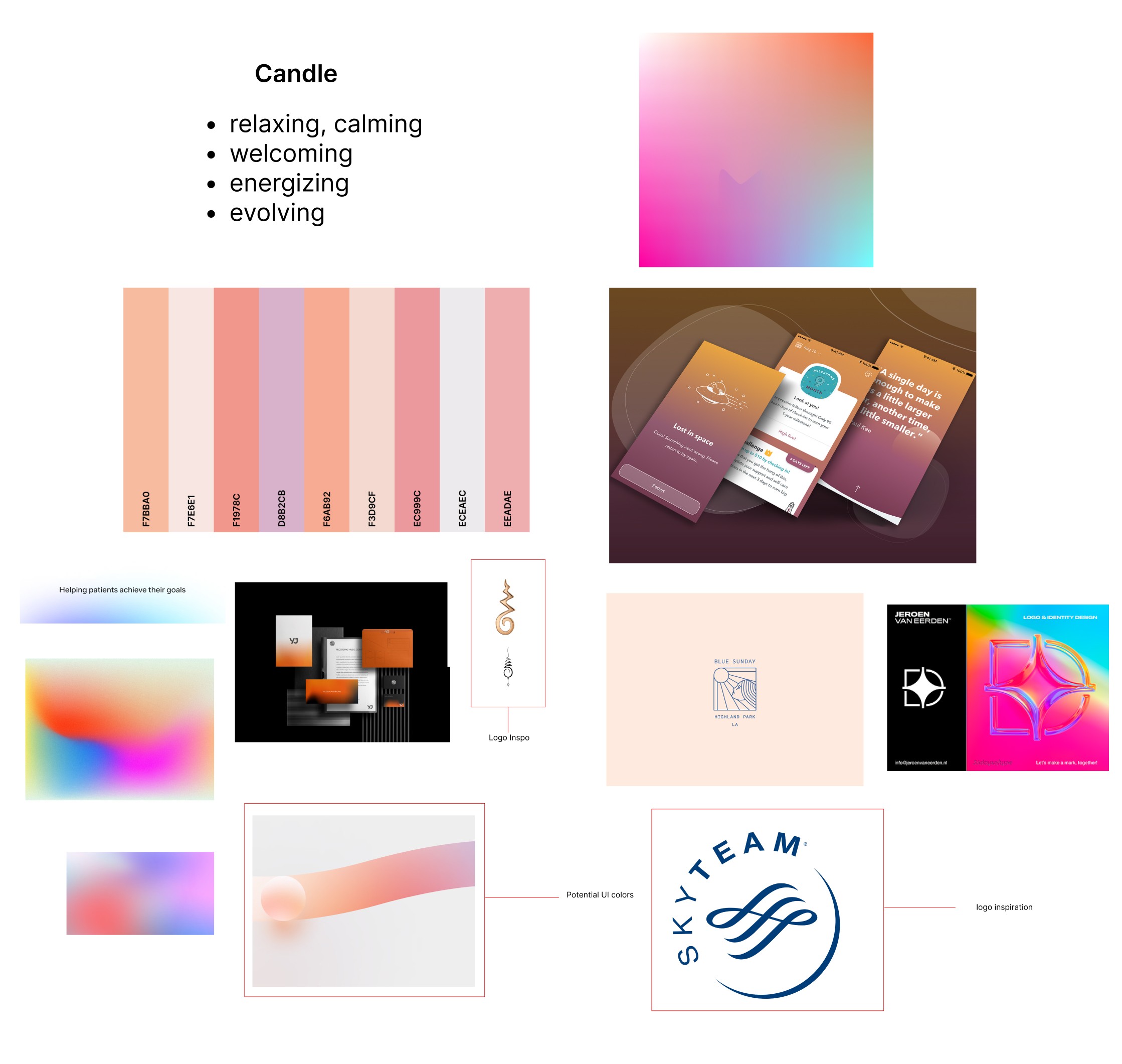
I created low fidelity wireframes of the flows I wanted to highlight based on my user research and competitive analysis.
CREATIVE DESIGN
Designing the branding and look + feel for Candle started with my user and market research, as well as researching on sites like Dribbble and Pinterest for brands that I could draw inspiration from.
01 /
Colors
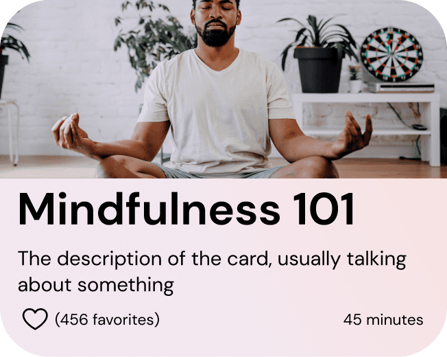
I utilized colors that invoked a sense of calm. I leaned towards pastels and muted tones, while using colors that still instilled an energizing quality to the app.

02 /
Typography
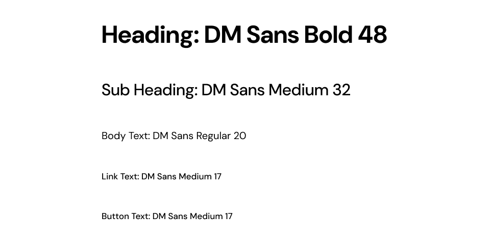
I went with DM Sans, wanting to lean into a assertive but versatile font style that could anchor the entire Candle experience.
02 /
Logo
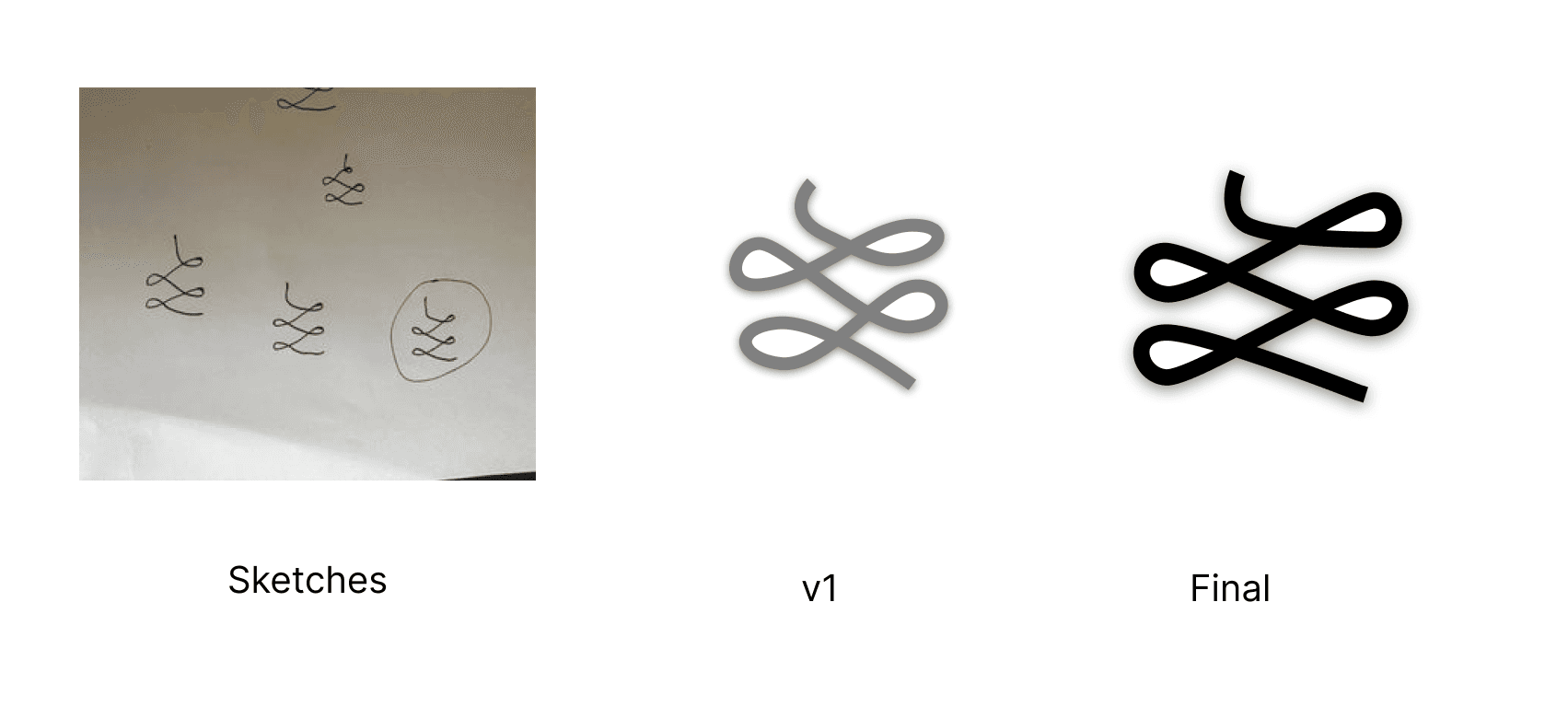
The logo for candle was inspired by the unalome, an ancient symbol which represents the path to enlightenment. I reimagined the unalome in a simplified manner and added my own touch to it. All my sketching and composing of the logo was done in Adobe Illustrator.
ACTUALIZATION
In order to best understand SoundCloud and how to approach this feature, I researched three main competitors Spotify, Audius, and Apple Music, while focusing my insights on how collaborations are uploaded.
01 /
Prototype
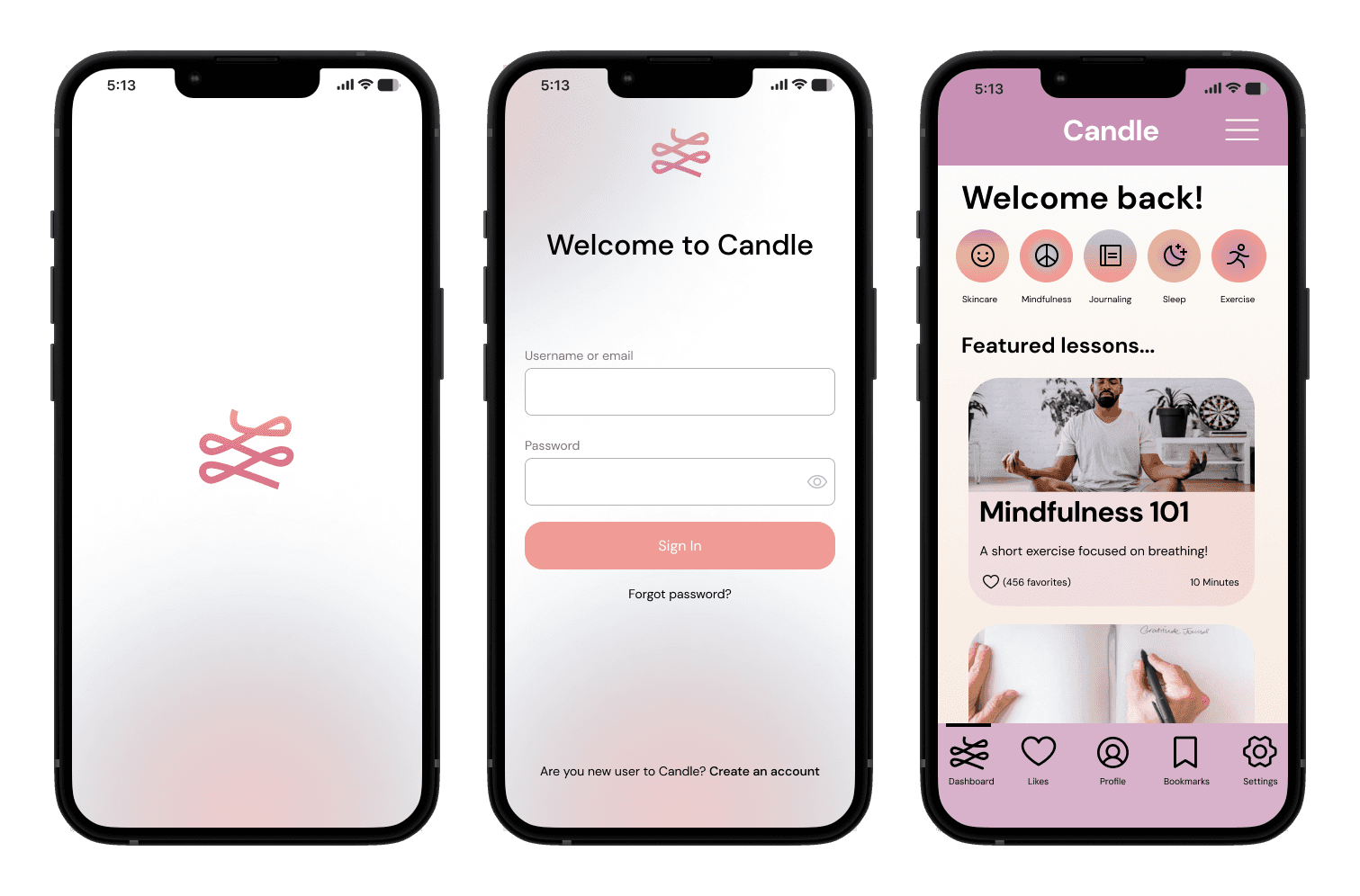
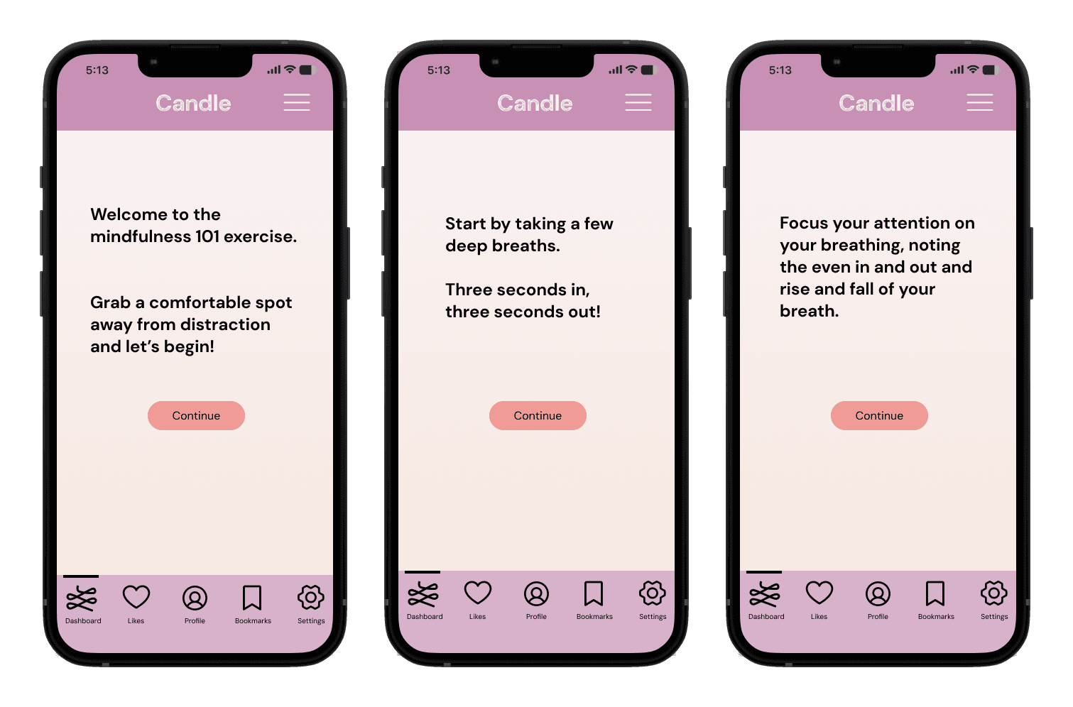
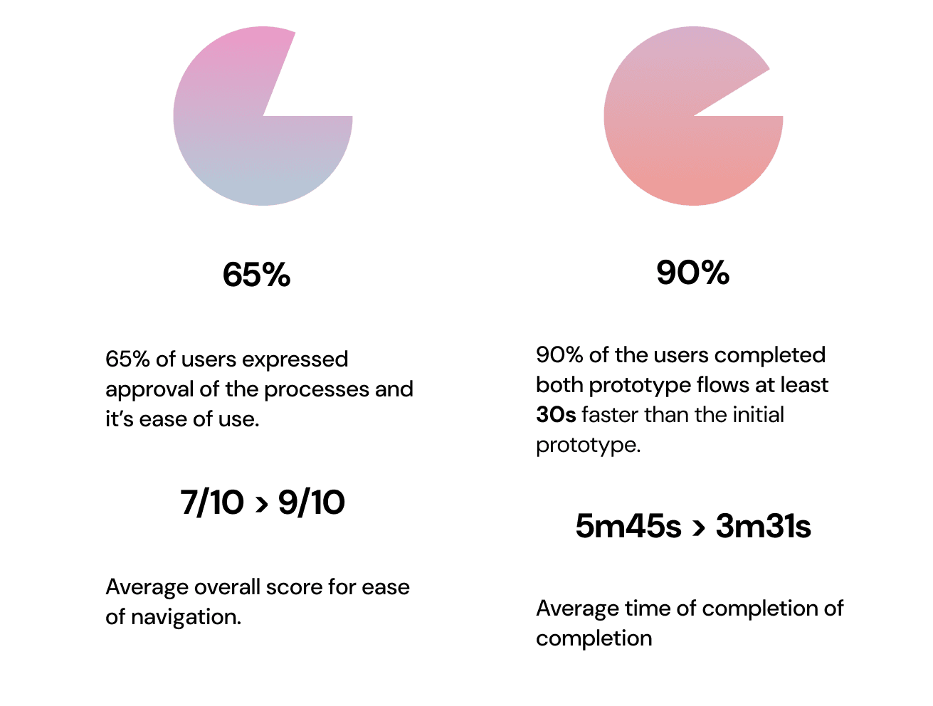
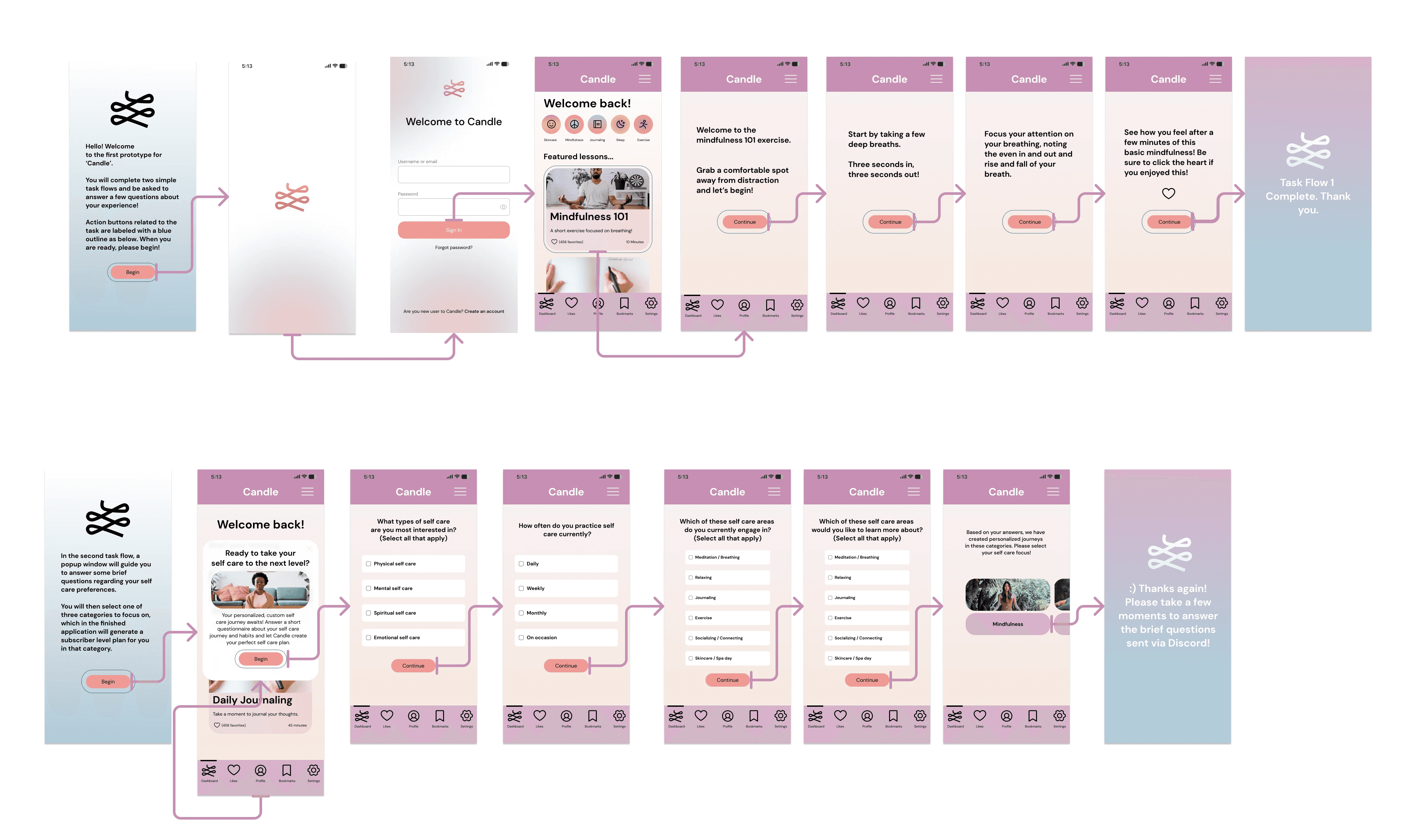
Utilizing my user research, wireframes, and branding, I created an initial prototype highlighted two user flows to test with users.
02 /
User Testing
Via Discord, Figma, and OBS, I monitored and recorded users as they navigated the initial prototype for Candle.
SUMMARIZING
Reflection
This was my first experience in creating an end to end mobile app and prototype. It gave me valuable experience building interfaces and interactions in Figma, as well as fuel for ideas moving forward.
