Challenge
Staying focused in todays world where a myriad of distractions are always around can be a challenge.
Solution
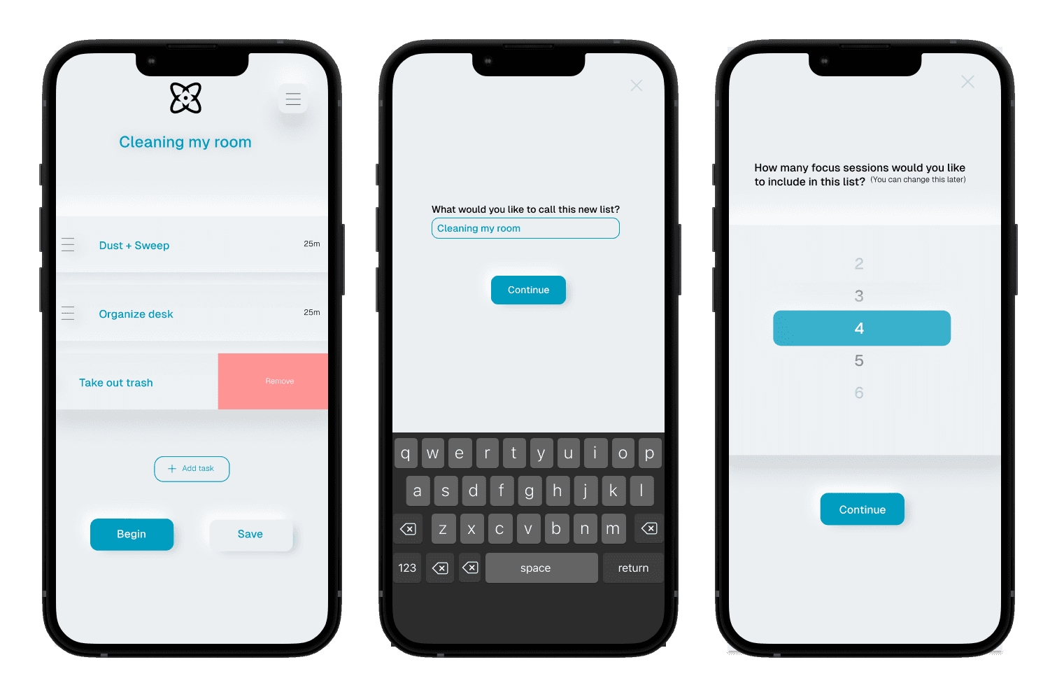
Nucleus is a mobile based Pomodoro timer than allows you to create customized timers from to do lists.
Role
Visual Identity, Research, Prototyping
I interviewed five users, asking them questions regarding their focus habits, desired improvements, and knowledge of Pomodoro timers.
Summarized Findings
The desire to improve focus habits is unanimous.
Users would like to prioritize or list tasks but require a simple UI.
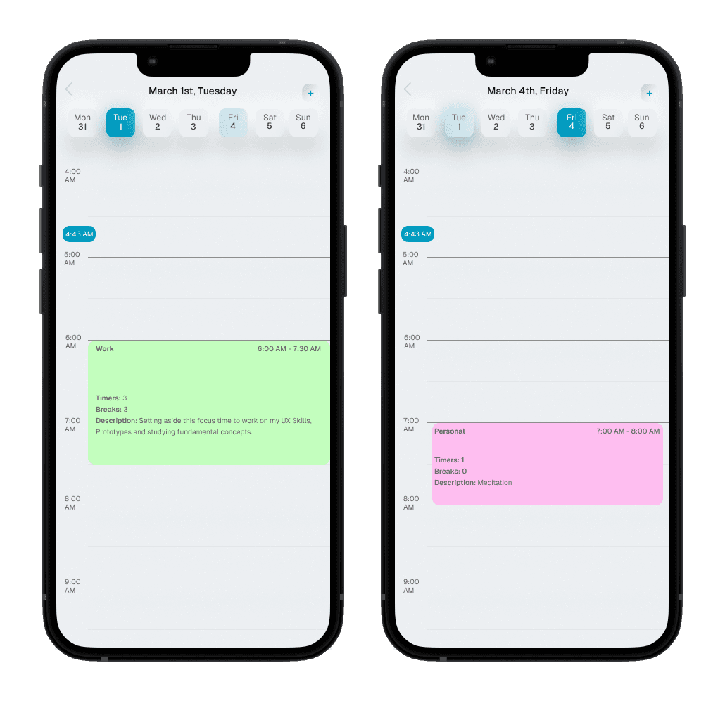
It would be ideal to be able to split tasks into categories such as personal, work, and so forth.
Greyscale colors are desired, with any colors used to accentuate or "highlight". It's best to keep an application like this clean and not too distracting.
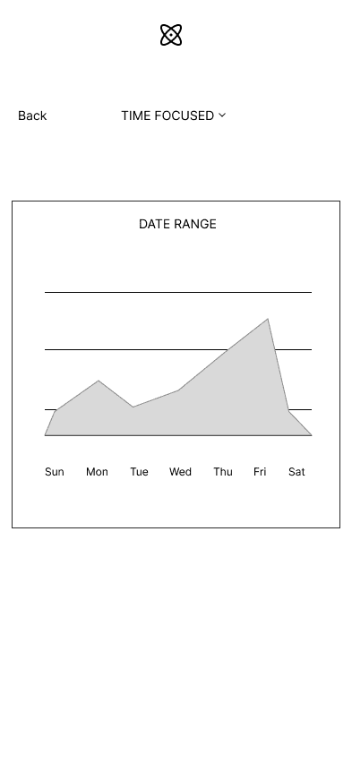
Users would like to track the rate of completion, as well as the time
spent on individual tasks/ categories.
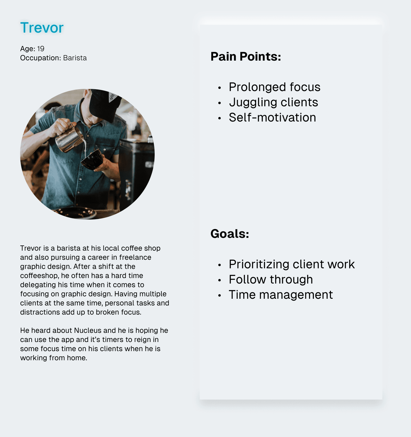
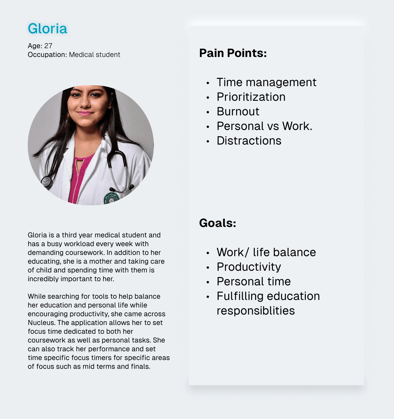
Using my research results, I created two personas to better understand the user's needs and goal for using Nucleus.
02 /
Logo
I designed the logo in Adobe Illustrator, using numerous icons and illustrations of atoms as inspiration. My final design represents focus in the center of the atom, as the nucleus, with the rings (usually used to represent protons and neutrons) representing the container for focus that the product provides!
02 /
Typography
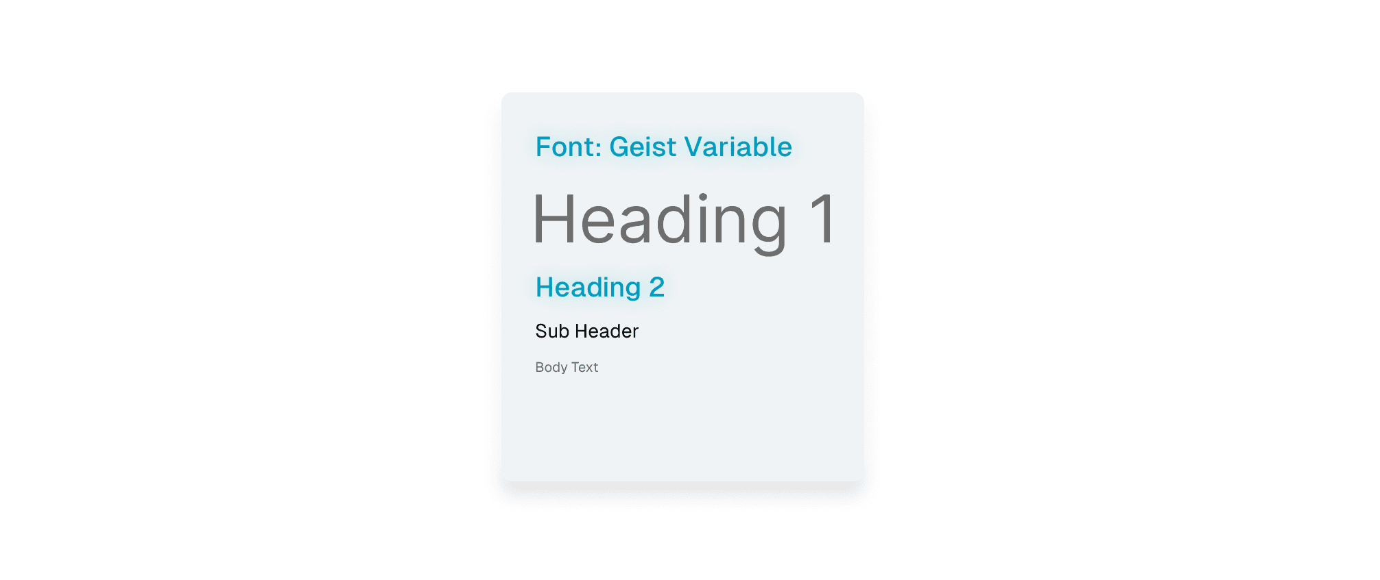
Geist embodies the design principles of simplicity, minimalism, and speed, drawing inspiration from the renowned Swiss design movement. The minimal nature of this monospace font aligned well with the purpose of the app.
CREATIVE DESIGN
I knew that I wanted to use greyscale hues with pastel accents, and that I wanted the app to have a modern feel. I looked at smart home apps and the Tesla app to find some inspiration.
01 /
Colors
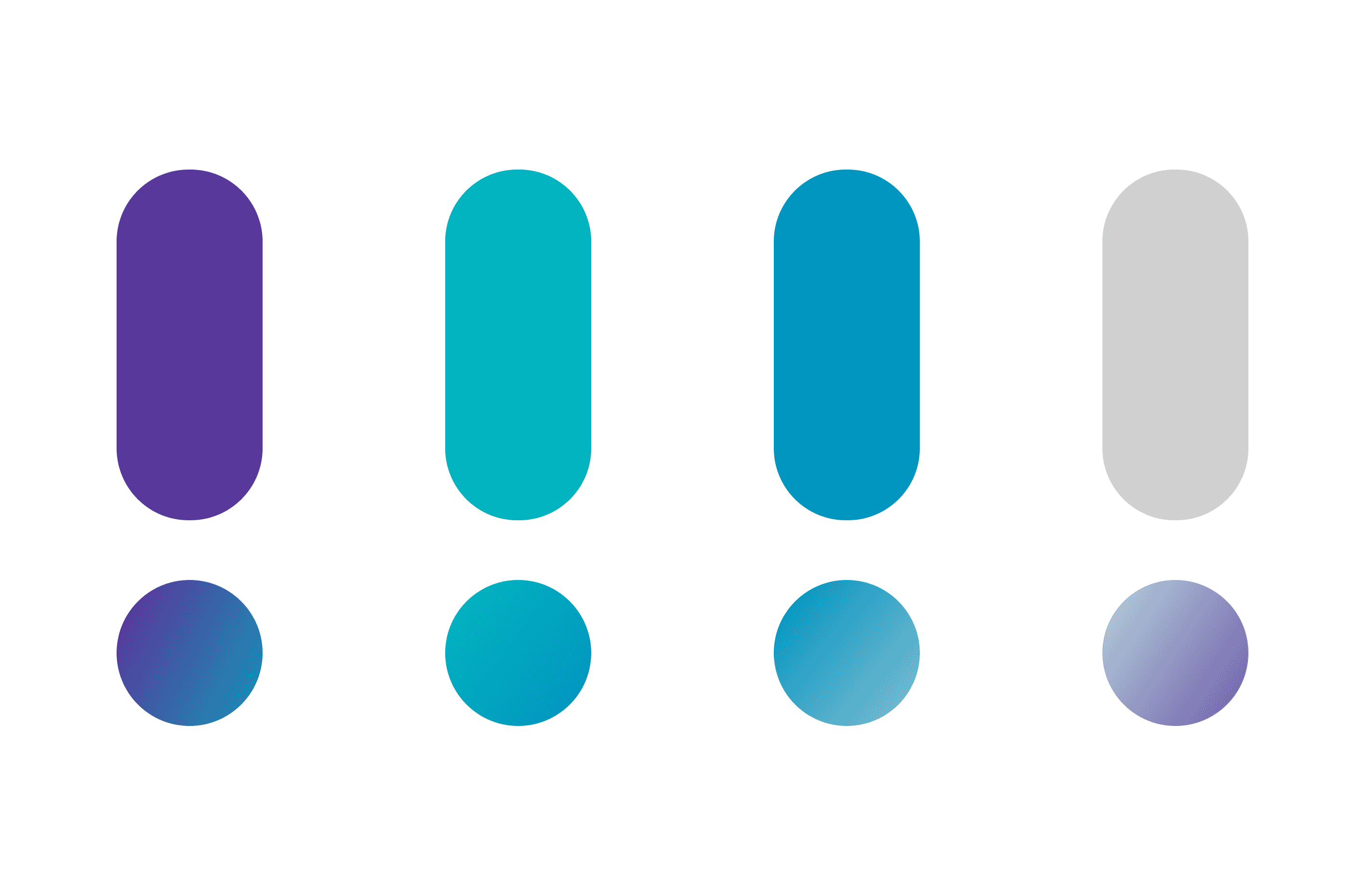
Based on the user interviews, I knew that blues, greens, greys were often associated with focus and were preferential to use for Nucleus. I experimented with palettes online until I found a complementary teal blue that anchored the entire color scheme.
OBSERVING AND ITERATING
Wireframing
01 /
Low Fidelity
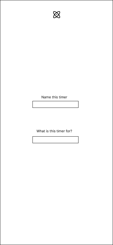
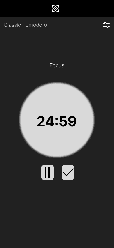
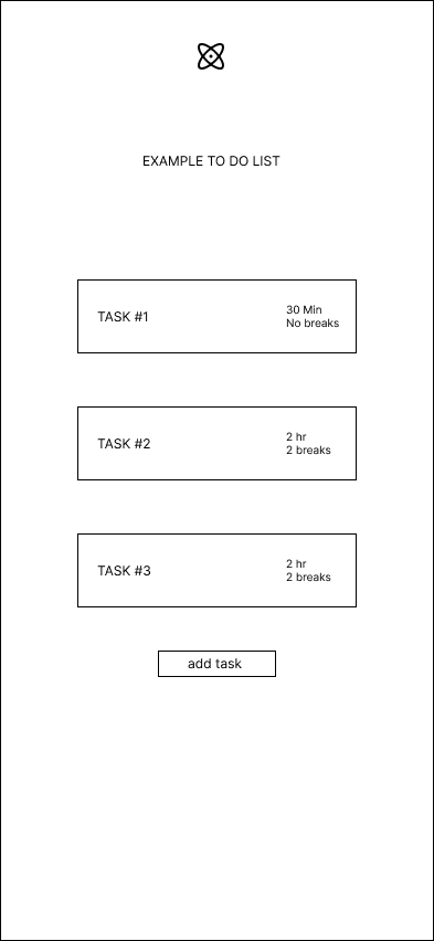
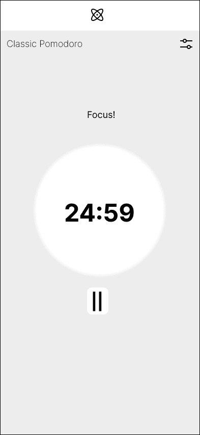
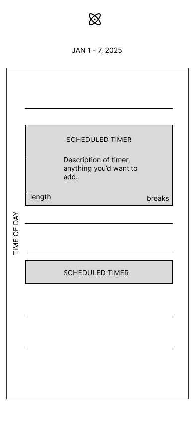
With the prioritized flows and features in mind, I began creating low fidelity wireframes to help understand how the UI for Nucleus will feel. This included experimenting with a light and dark mode, for which I decided to implement the light mode.
01 /
Creating Flows
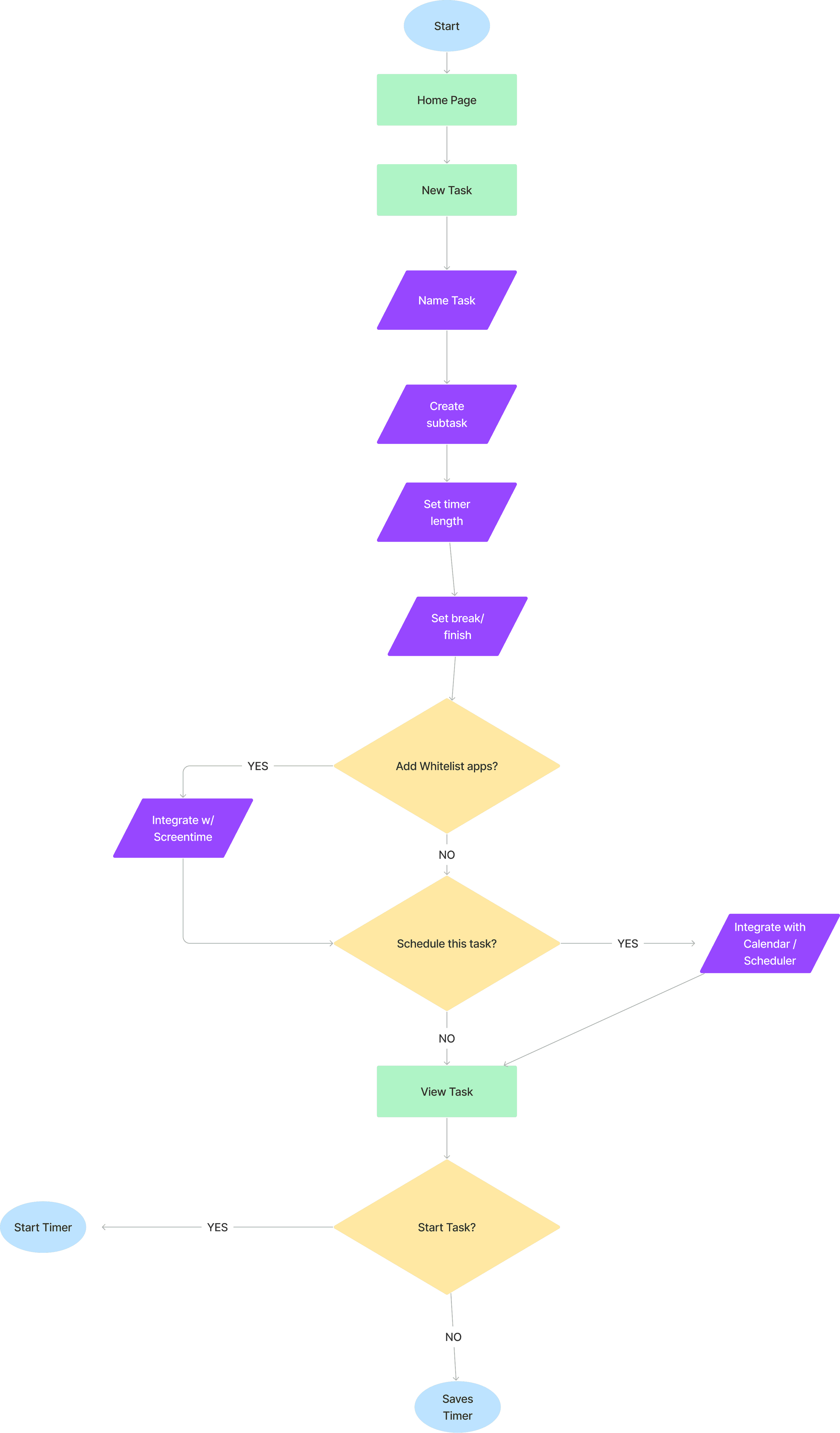
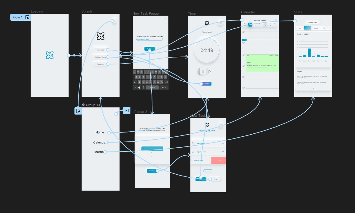
After prioritizing the necessary features, I began drafting site maps and user flows to help better understand how the user will navigate the app and ultimately hone their focus.
TESTING AND REFINING
Usability Testing
01 /
Initial Prototype
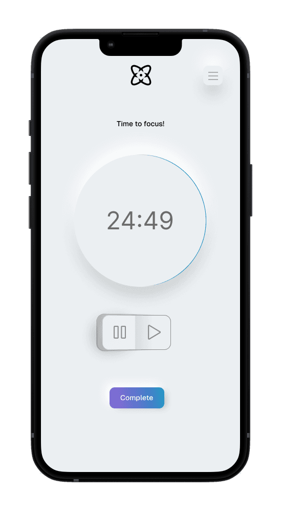
Using my design system, user flows, and wireframes, I created an initial prototype to test with users for feedback. This initial prototype consisted of a splash screen, timer view and statistics/ metrics. Because the aim of this project was to create a unique visual design, I focused most of my attention on the visual identity of the screens.
02 /
User Testing Results
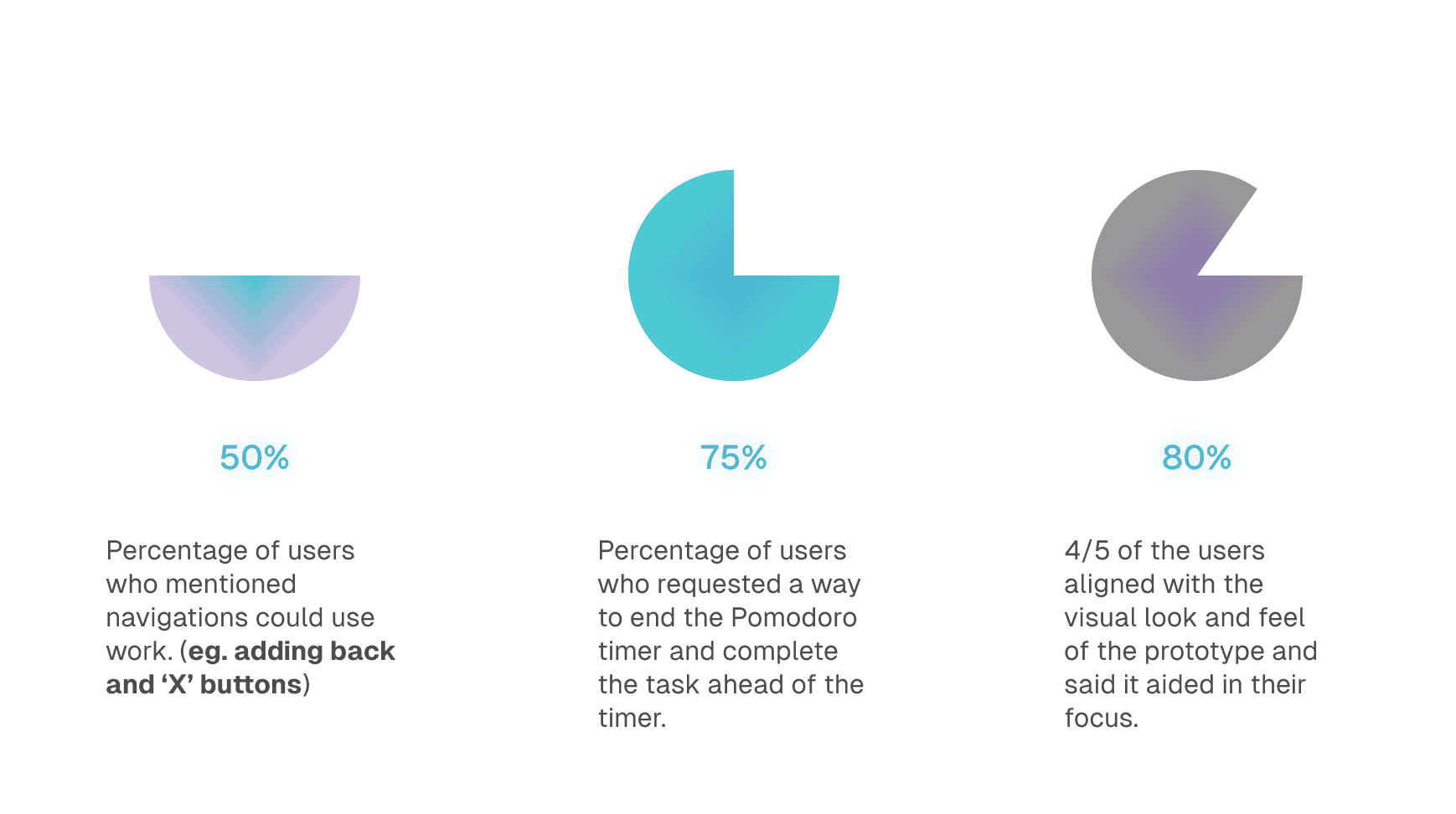
One of the main takeaways from the initial tests was that there was lack of clarity in the navigation. Users requested methods to complete the Pomodoro timer ahead of time, as well as navigate through the app freely using closing "X" buttons and back navigation.
FINAL WIREFRAMES
SUMMARIZING
Reflection
This case study gave me valuable insight into "glassmorphism" and "neomorphism" design styles and also taught me how to prioritize the user and simplicity when building an interface.

