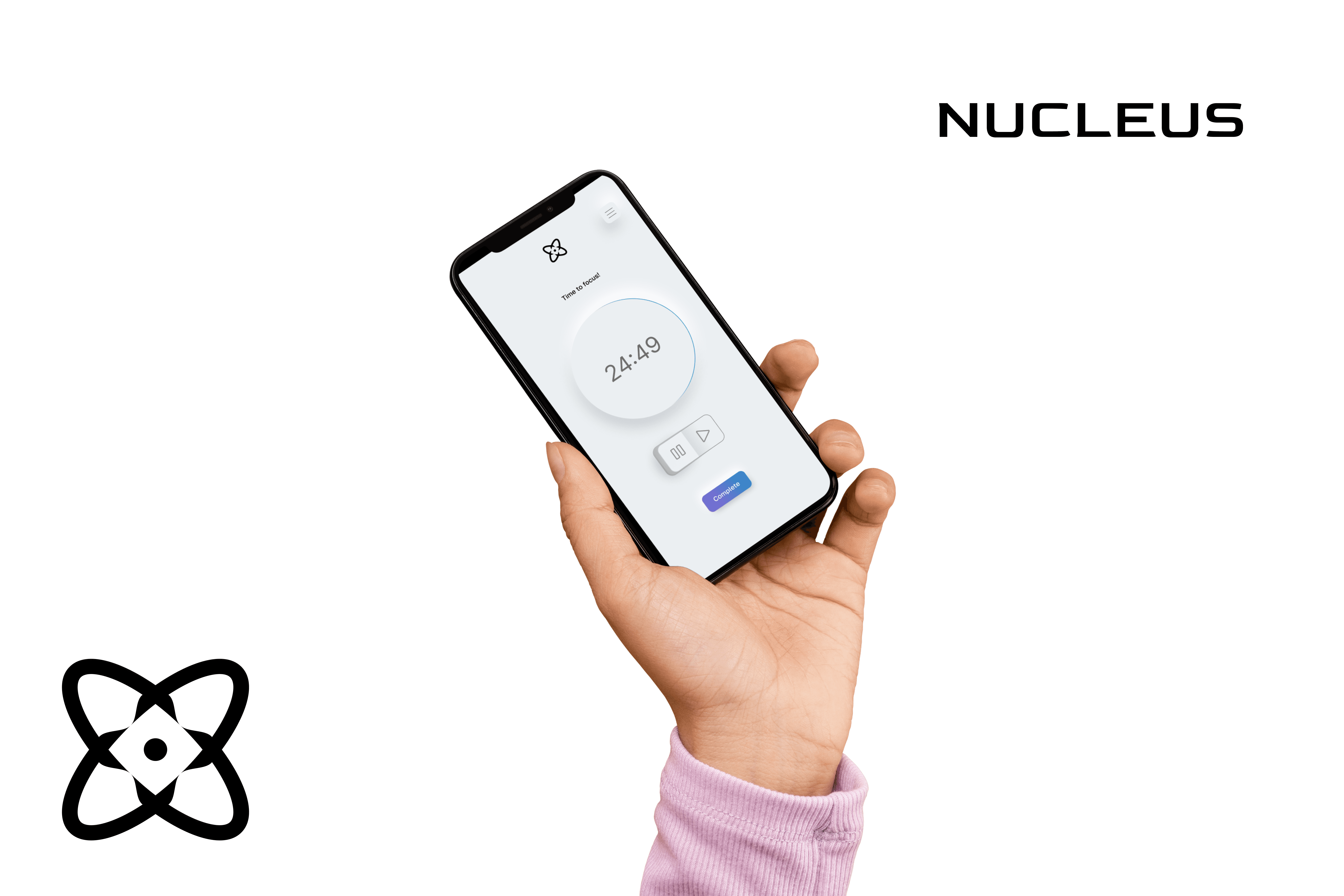
A to-do list that's Pomodoro powered
Time is our most valuable resource and possibly the greatest luxury. The Pomodoro technique breaks down focus into manageable chunks of time dedicated to a specific task. I felt that the Pomodoro method could be used for any manner of to-do list and set out to envision a product that could help everyone manage focus their time.
Challenge
it can be hard to stay current with treating yourself right do the fast paced nature of today's world.
Solution
Candle offers personalized self-care journeys initiated with a simple onboarding process utilizing guided surveys.
Role
Candle offers personalized self-care journeys initiated with a simple onboarding process utilizing guided surveys.
CREATIVE DESIGN
Designing the brand
In order to best understand SoundCloud and how to approach this feature, I researched three main competitors Spotify, Audius, and Apple Music, while focusing my insights on how collaborations are uploaded.
01 /
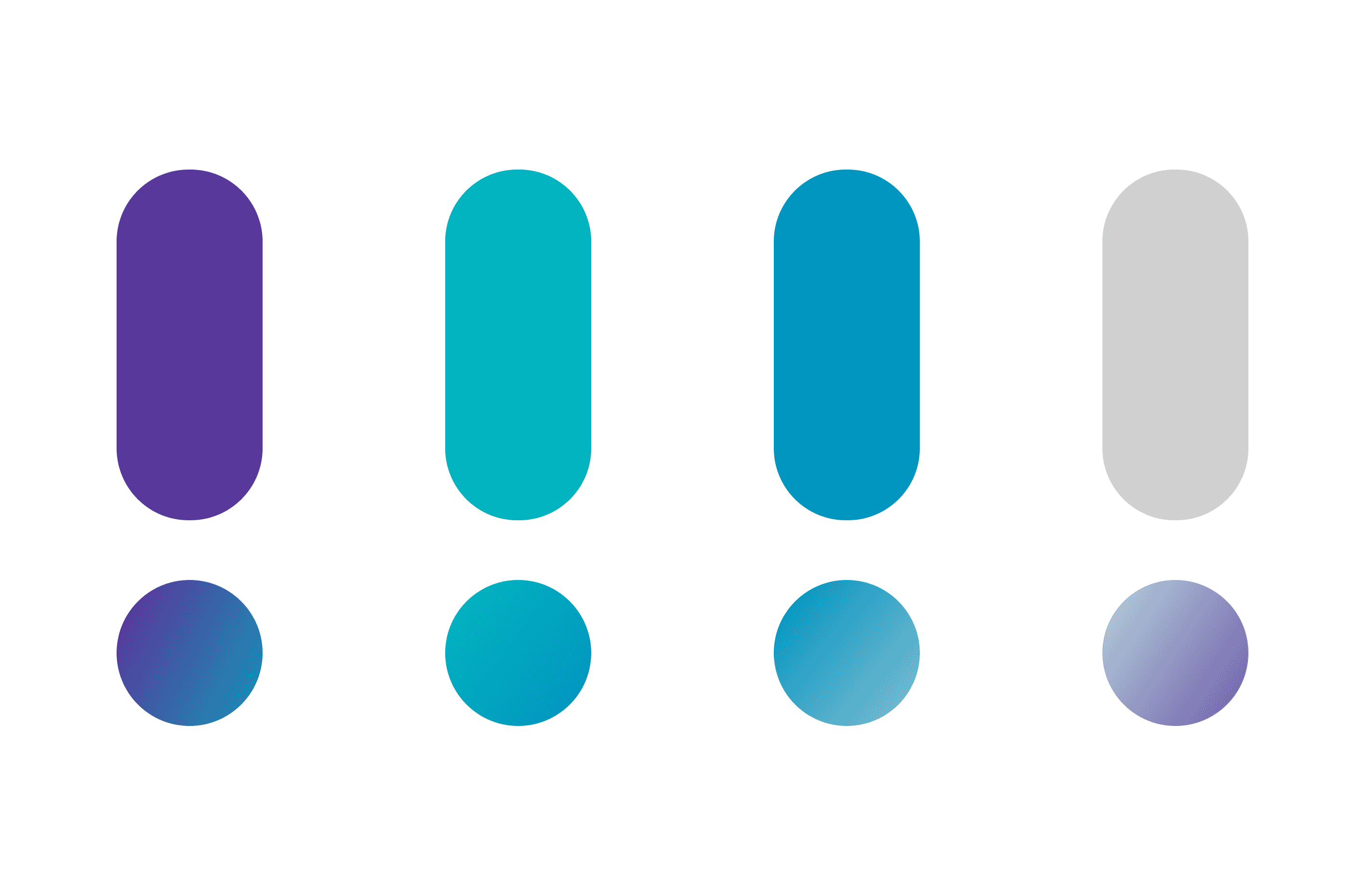
Colors
I utilized colors that invoked a sense of calm. I leaned towards pastels and muted tones, while using colors that still instilled an energizing quality to the app.
02 /
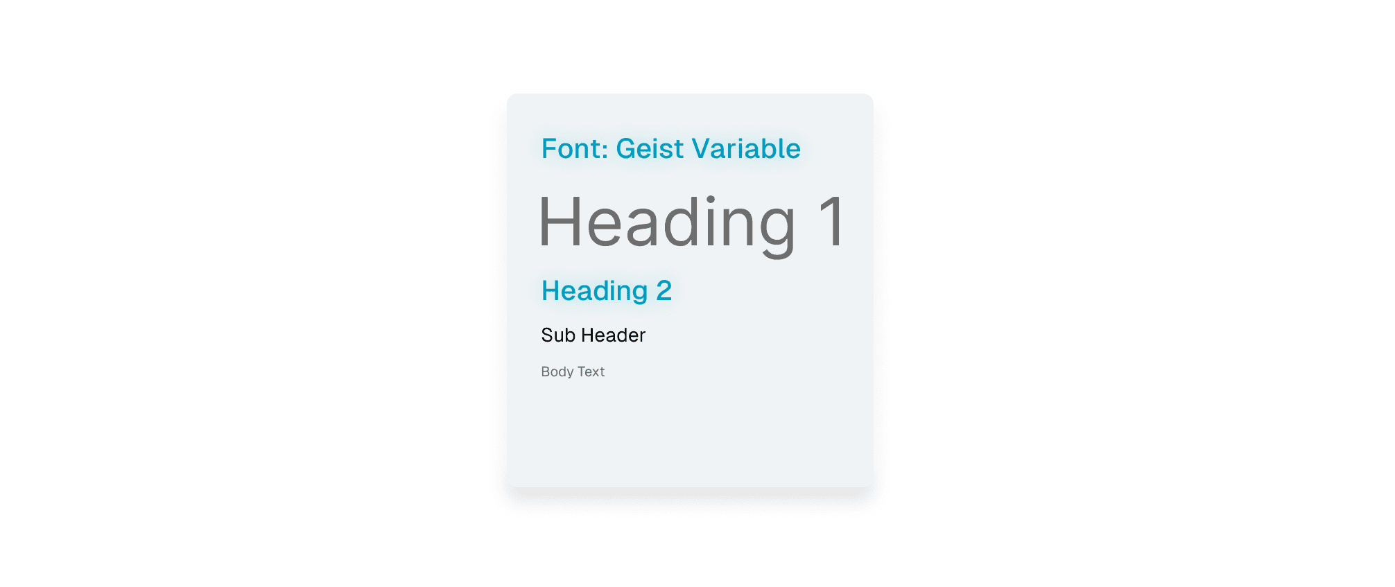
Typography
I went with DM Sans, wanting to lean into a assertive but versatile font style that could anchor the entire Candle experience.
02 /
Logo
The logo for candle was inspired by the unalome, an ancient symbol which represents the path to enlightenment. I reimagined the unalome in a simplified manner and added my own touch to it. All my sketching and composing of the logo was done in Adobe Illustrator.
OBSERVING AND ITERATING
Research
01 /
User Interviews
In addition to interviewing users, I did competitive analysis via the SWOT method to break down what made some similar apps available, and what we could do differently.
Summarized Findings
The desire to improve focus habits is unanimous.
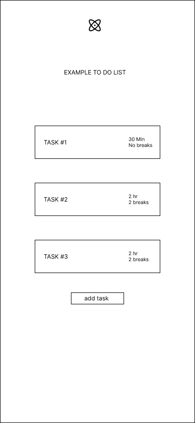
Users would like to prioritize or list tasks but require a simple UI.
It would be ideal to be able to split tasks into categories such as personal, work, and so forth.
Greyscale colors are desired, with any colors used to accentuate or "highlight". It's best to keep an application like this clean and not too distracting.
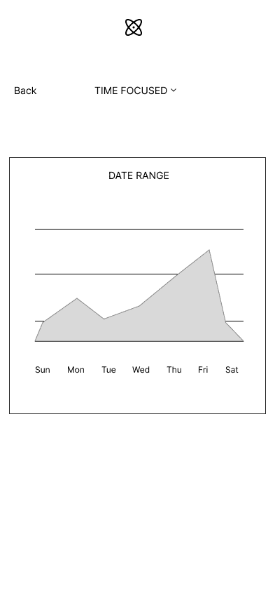
Users would like to track the rate of completion, as well as the time
spent on individual tasks/ categories.
OBSERVING AND ITERATING
Wireframing
01 /
Low Fidelity
With the prioritized flows and features in mind, I began creating low fidelity wireframes to help understand how the UI for Nucleus will feel. This included experimenting with a light and dark mode, for which I decided to implement the light mode.
01 /
Creating Flows
After prioritizing the necessary features, I began drafting site maps and user flows to help better understand how the user will navigate the app and ultimately hone their focus.
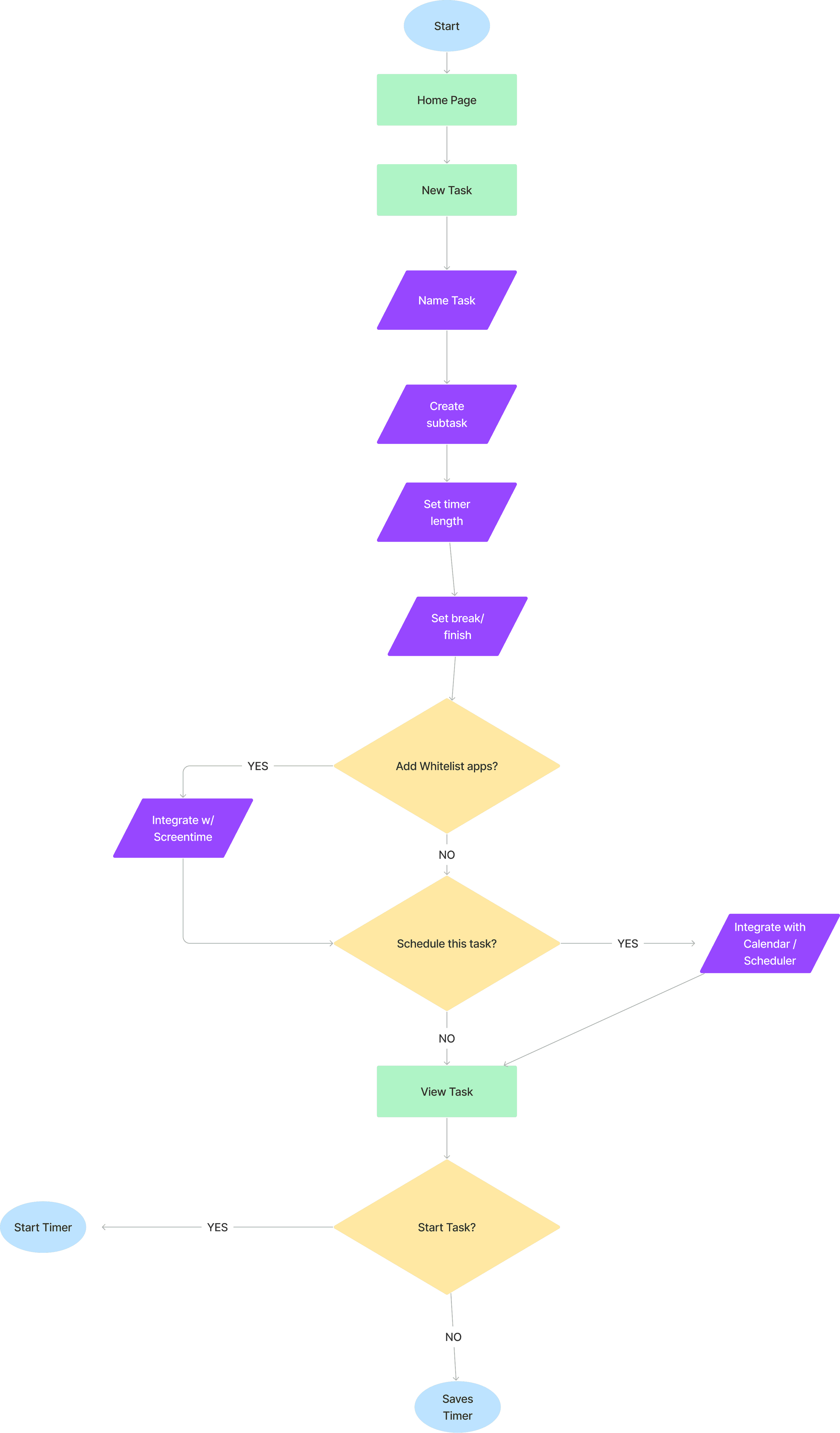
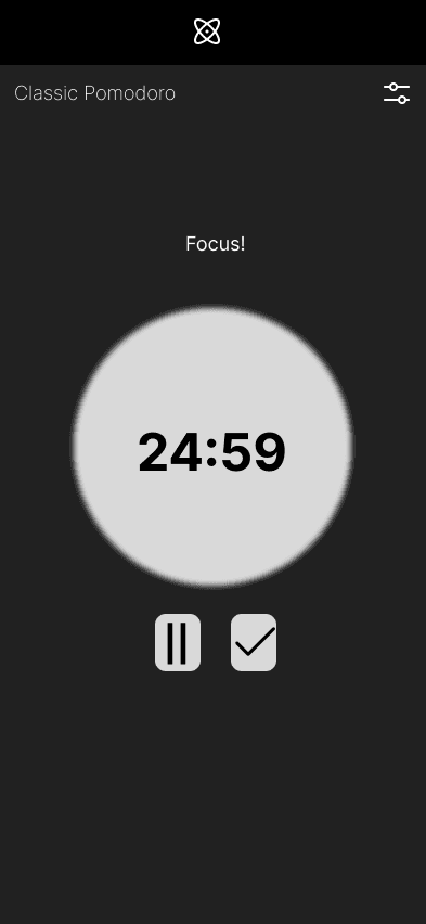
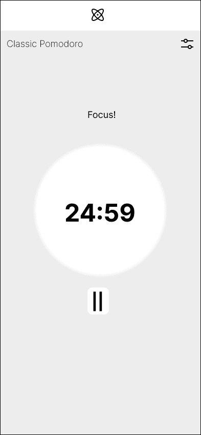
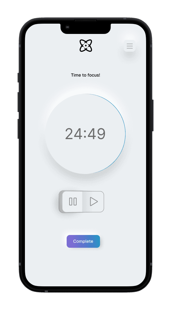
Timer / Home Screen
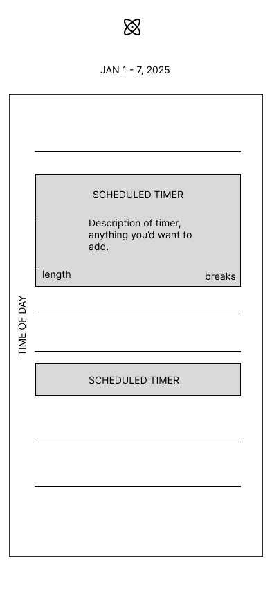
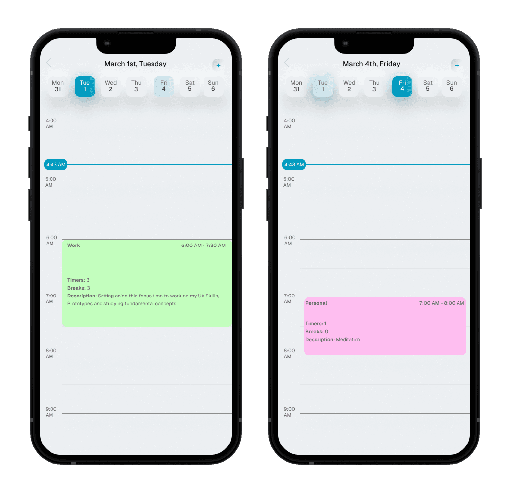
Calendar
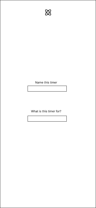
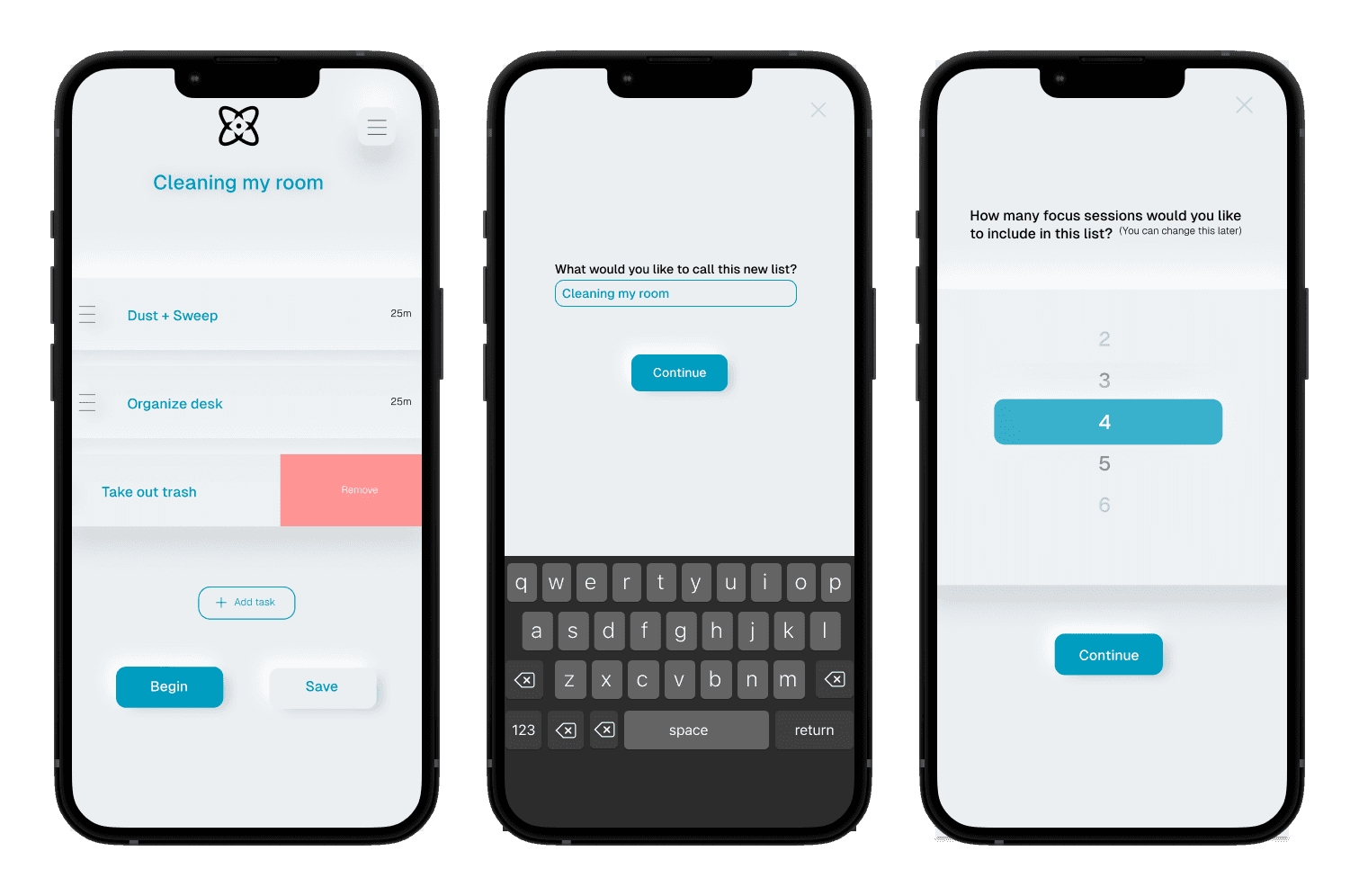
Create new timer
SUMMARIZING
Reflection
In addition to interviewing users, I did competitive analysis via the SWOT method to break down what made some similar apps available, and what we could do differently.
View Prototype
