


I was first inspired by the visual style of glassmorphism and started practicing by making wireframes within the style. However, I then shifted my focus to neumorphism.

Nucleus

I designed the logo in Adobe Illustrator, using numerous icons and illustrations of atoms as inspiration. My final design represents focus in the center of the atom, as the nucleus, with the rings (usually used to represent protons and neutrons) representing the container for focus that the product provides!
Logo
Building the UI
Prioritization Matrix
Maps & Flows


After prioritizing the necessary features, I began drafting site maps and user flows to help better understand how the user will navigate the app and ultimately hone their focus.

Close up of user flow
I then presented my prototype to the four participants I had presented the concept to, in hopes to find what could be revised and iterated upon. I asked them to navigate the flow and envision that they were uploading a collaborative track.
Results
Usability Testing


Revisions


Must Have
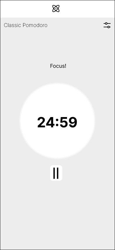
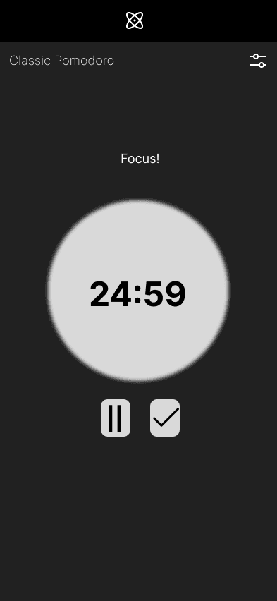
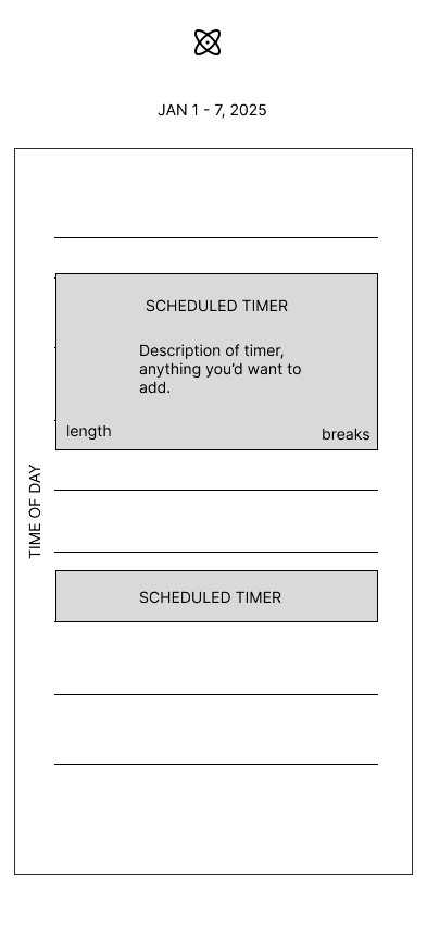
Timer interface
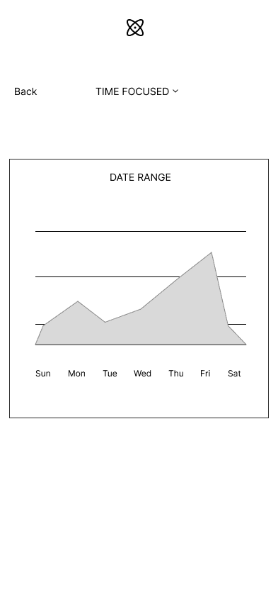
Metrics Tracking
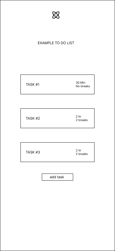
Task creation
Category sorting
Should Have
Introduction to Pomodoro technique
Light/Dark modes
Could Have


Defining Goals

Adding to the personas, affinity mapping was used to establish takeaways that would lead into prioritizing the feature set for the product.
Honing our focus
SYNTHESIS AND IDEATION
Look and feel
BUiLDING A UI


Competitor Analysis
I analysed three of the leading focus timer / pomodoro timer applications on the app store, Focus Timer, Pomofocus, and Pomodoro. Customers seemed drawn to these apps for similar features:
First, we need to synthesize our research into the best priorities to focus on while building out Nucleus.
Two personas were created, to paint a picture of a typical Nucleus user and how the app could benefit them. The personas and the varying aspects of their pain points and aspirations already demonstrates that the app's ability to help focus can apply to work, personal matters and overall time management as a whole.

User Interviews
Putting in time
RESEARCH
The Pomodoro effect
OVERVIEW


High Fidelity Wireframe
First Iteration
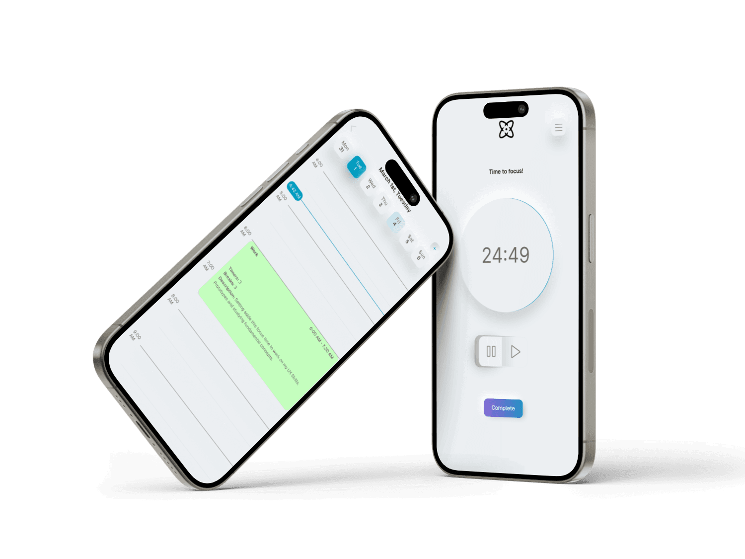
Staying focused in todays world where a myriad of distractions are always around can be a challenged. The Pomodoro technique is based around a timer that breaks down periods of focus into manageable pieces, interspersed with short and long breaks. Nucleus is a mobile based Pomodoro timer than allows you to create customized timers from to do lists, as well as track your focus progress and temporarily disable apps while in focus mode.
Time is our most valuable resource and possibly the greatest luxury. The Pomodoro technique breaks down focus into manageable chunks of time dedicated to a specific task. I felt that the Pomodoro method could be used for any manner of to-do list and set out to envision a product that could help everyone manage focus their time.
Finding a solution


To- Do List module


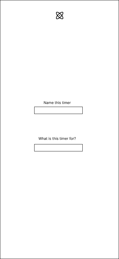
Naming a new To - Do List
Pomodoro timer in action
Loading + Splash screen.
Calendar view
Weekly metric tracking
Final interactions overview.


Prototype
I felt that neumorphism worked well for an app of this nature, and began to build out the UI and visual identity of the product. It had a minimal feel and I enjoyed the use of shadows to create elements. I began building the UI.

In order to define these must-have features, we need to contextualize the user journey in some manner. For this I move into user/task flows and site mapping.
I knew that I wanted to use greyscale hues with pastel accents, and that I wanted the app to have a modern feel. I looked at smarthome apps and the Tesla app to find some inspiration.
Conclusion
Next Case Study
Sketching
LOW FIDELITY WIREFRAMING
With the prioritized flows and features in mind, I began creating low fidelity wireframes to help understand how the UI for Nucleus will feel. This included experimenting with a light and dark mode, for which I decided to implement the light mode.


